![]()
Matthew Brannon
Viewing Room
Casey Kaplan
Casey Kaplan is pleased to present a cross-section of artworks by Matthew Brannon (b. 1971, Anchorage, AK), produced between 2008 and 2013, in both our physical and online viewing rooms. Two letterpress prints are paired with an early silkscreen, alongside a wall-based sculpture that brings nearby imagery into the round. These early works have since spawned sculptural installations and complexly crafted silkscreens (most recently grounded in a research-based exploration of the Vietnam/American War), though the core of Brannon’s practice has remained: the anxious desires that drive us. As we look back at the evolution of Brannon’s signature graphic style and the two and three-dimensional components of an ongoing psychological journey, the artist reflects on his own motivations and considerations:
I was a film noir casualty. I saw myself as a writer’s artist. I wanted to create holistic exhibitions full of suggestion and double entendres. I was interested in how art worked. Conceptual art was my text. Los Angeles in the early 90s was my parent. I was a natural irritant. My writing was a ventriloquist act born of endless hours of film, music, and novels.
![]()
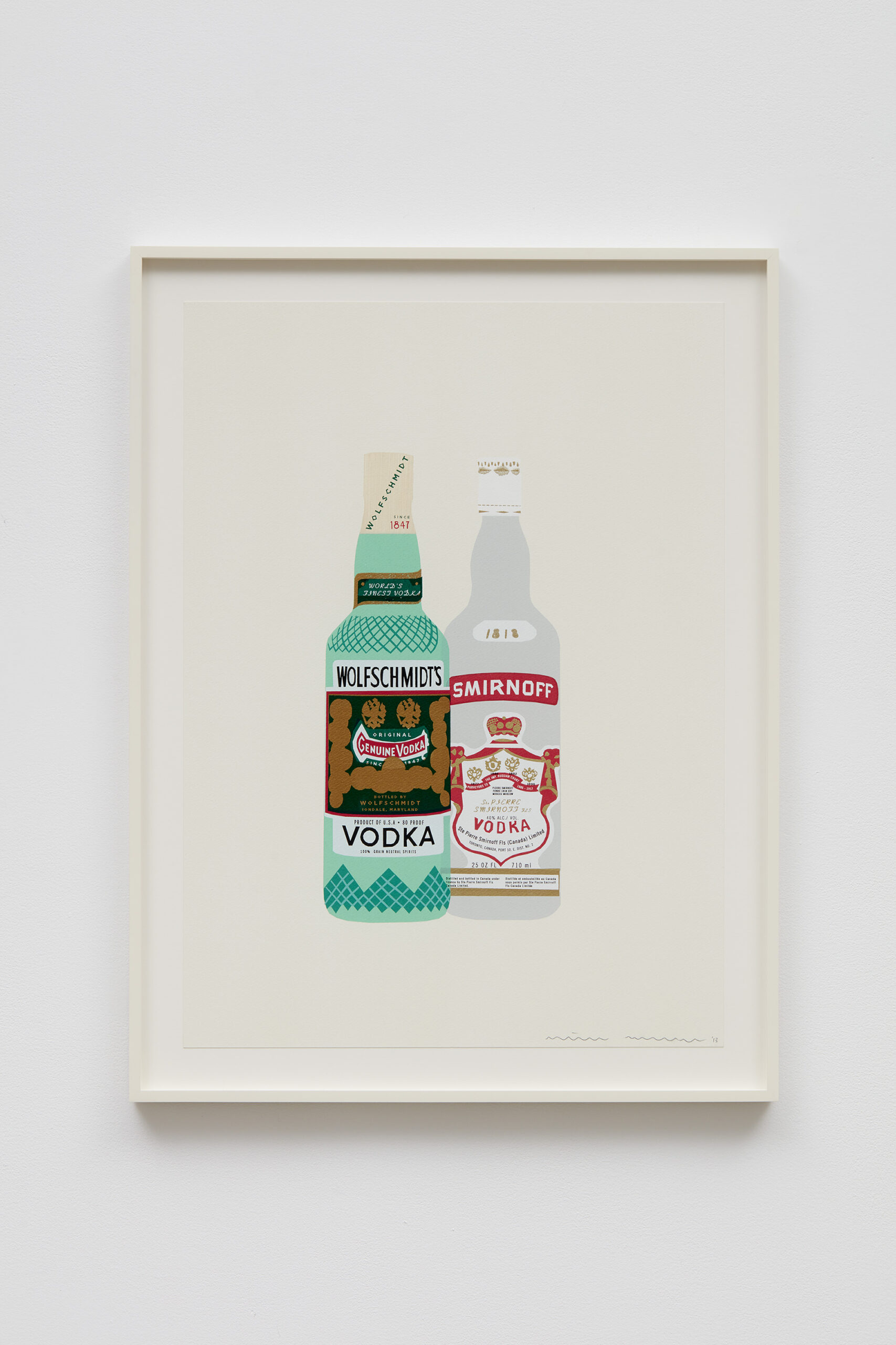
Matthew Brannon
Anything But, 2008
Letterpress on paper
24 x 18” / 61 x 45.7cm
Framed: 25.5 x 19.5” / 64.8 x 49.5cm
![]()
Detail: Matthew Brannon
Anything But, 2008
Letterpress on paper
24 x 18” / 61 x 45.7cm
Framed: 25.5 x 19.5” / 64.8 x 49.5cm
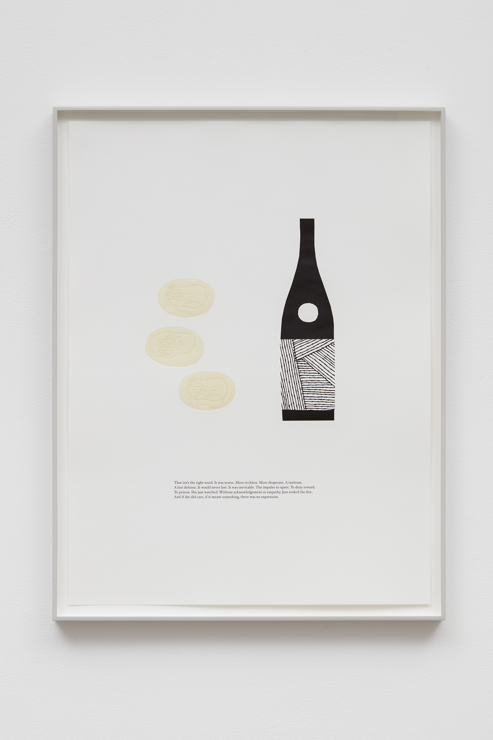
Beginning in 2002, Brannon’s letterpress prints have become the foundation for a longstanding exploration of the relationship between language and image through traditional printmaking processes. Sheets of rag paper embossed with saturated ink were influenced by a range of stylistic cues including mid-century advertising for objects of leisure made popular by Madison Avenue ad agencies. Brannon offset his imagery with abstruse, quasi-poetic phrases—what the artist has called a “salad of language.”
I began making these letterpress prints before my first solo exhibition. At the time, the medium was largely reserved for corporate stationery and wedding invites. As someone attracted to printed matter and all forms of promotion and periphery, I loved the sense of permanence it could give my wildest thoughts. The letterpress pieces were born out of my invented haunted house movie posters I’d been making (2001-2005). People assumed the writing was autobiographical. Autobiographical? Please. You don’t know me. Or so I told myself. But instead of shying away (my first instinct) from this supposed exposure, I recognized that through the text I could lean into these subject positions.* I was involved with psychoanalysis and the idea of turning my art into a ventriloquist's act or conceptual exorcism was exciting. And so more and more I started writing from the first person about the wildest of scenarios. I wrote daily, oodles of unpublishable horror born out of my neurosis of being invited deeper and deeper into the ‘art world’ in the aftermath of 9/11.
![]()
Detail:
Matthew Brannon
Anything But, 2008
Letterpress on paper
24 x 18” / 61 x 45.7cm
Framed: 25.5 x 19.5” / 64.8 x 49.5cm
![]()
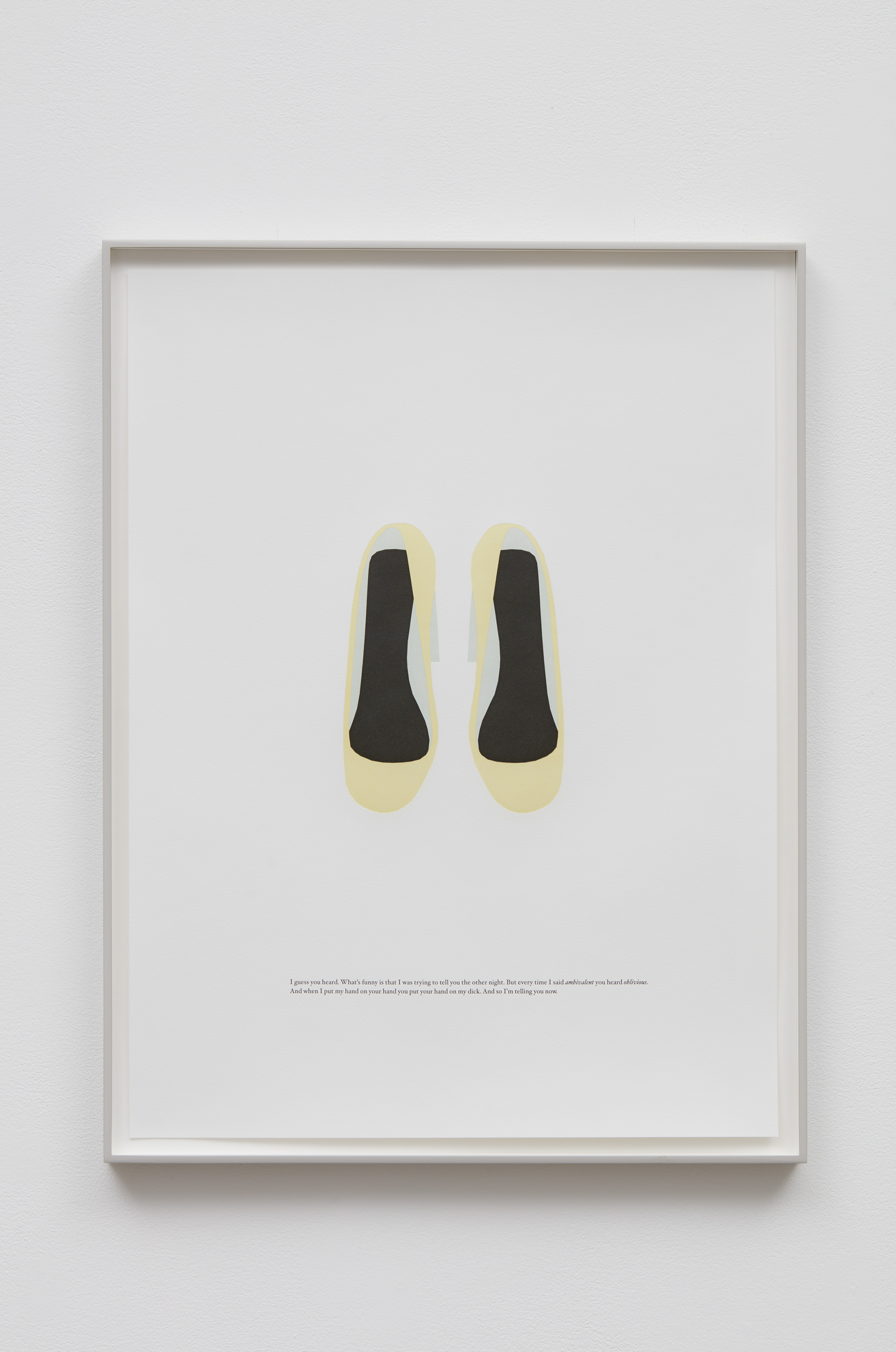
Matthew Brannon
Wasted Night, 2008
Letterpress on paper
24 x 18” / 61 x 45.7cm
Framed: 25.5 x 19.5” / 64.8 x 49.5cm
![]()
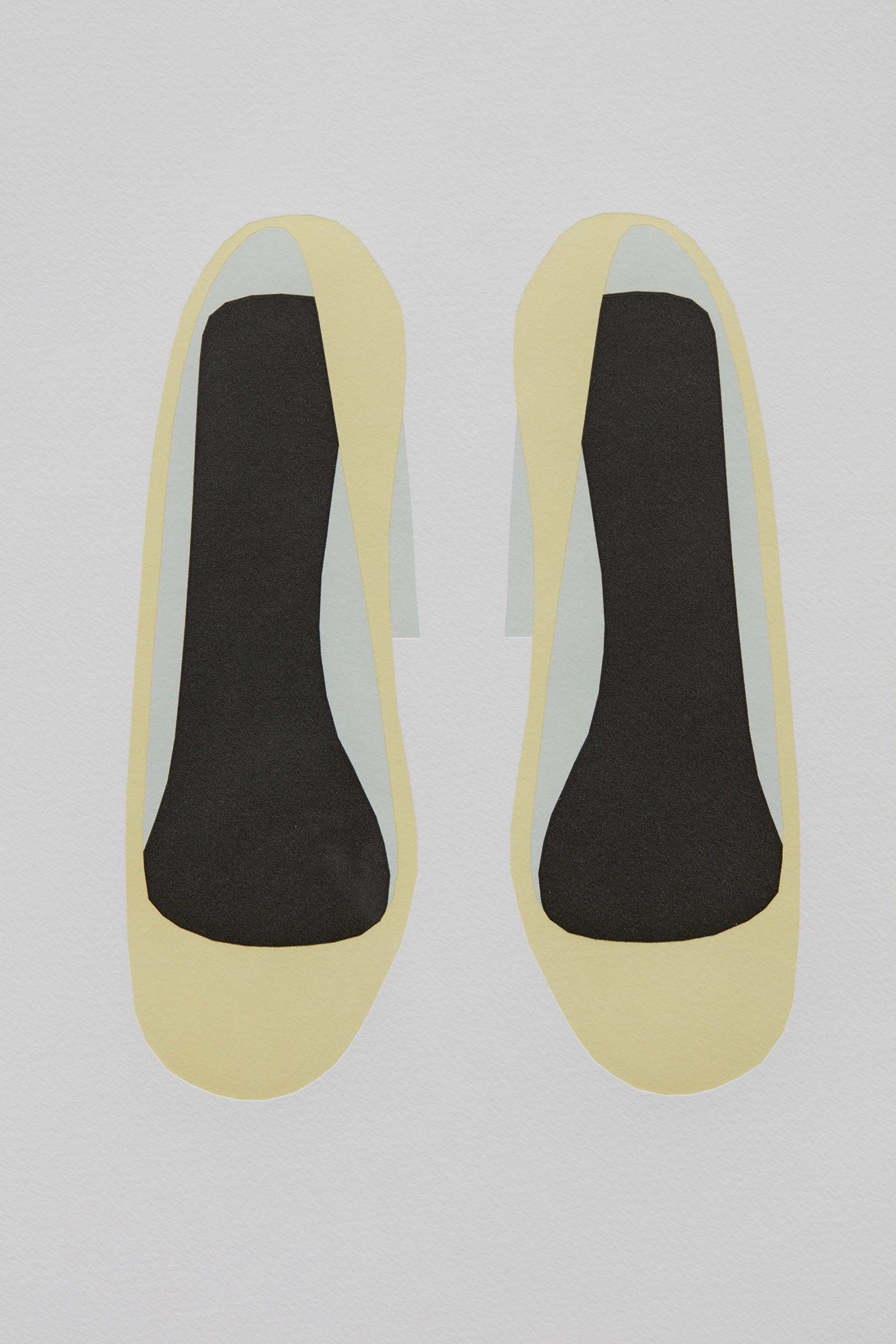
Detail:
Matthew Brannon
Wasted Night, 2008
Letterpress on paper
24 x 18” / 61 x 45.7cm
Framed: 25.5 x 19.5” / 64.8 x 49.5cm
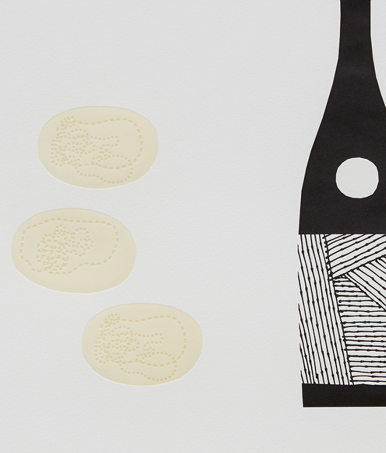
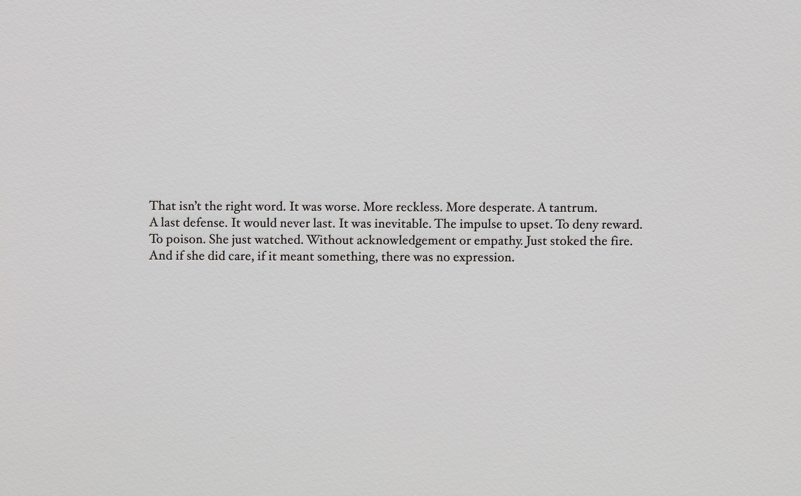
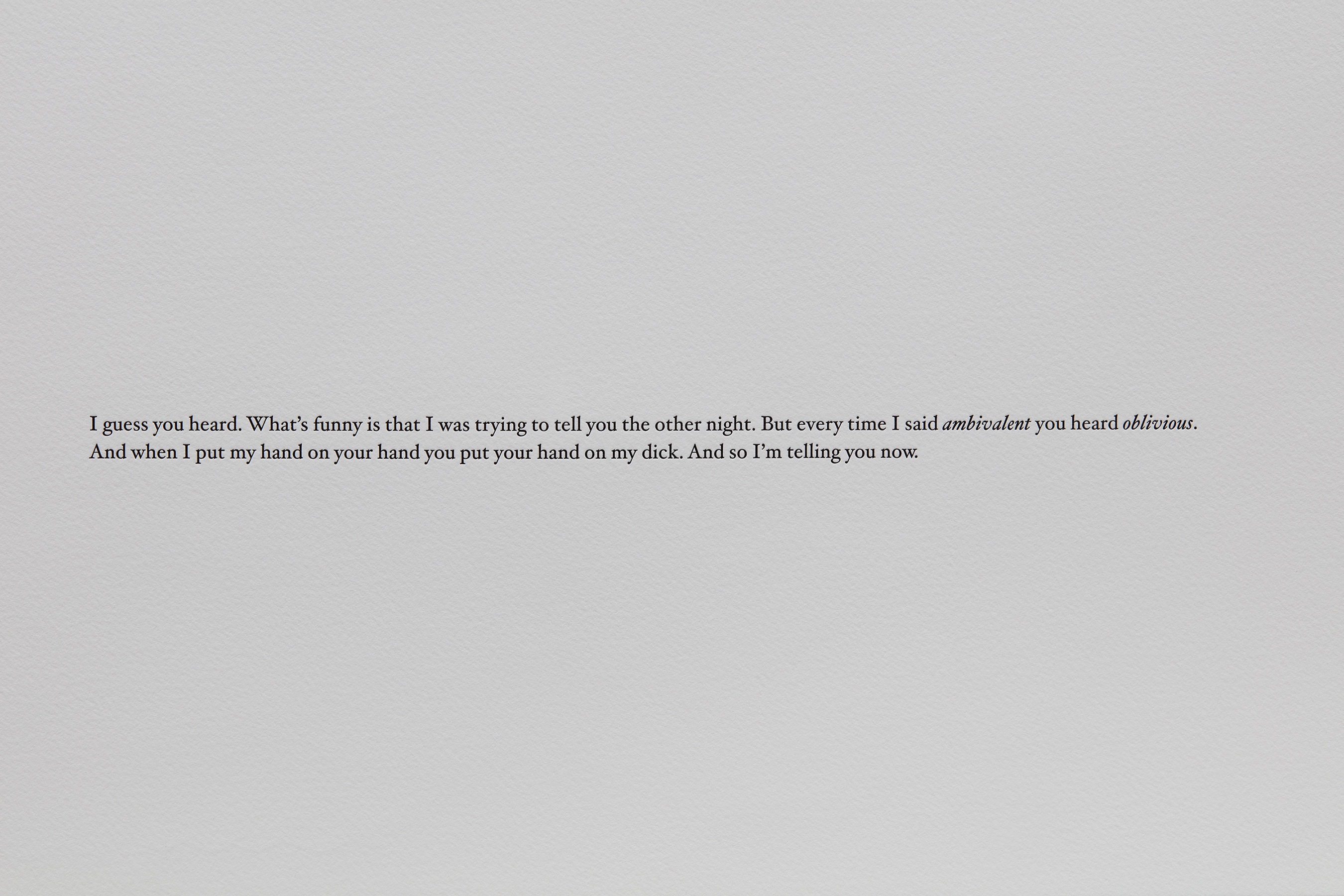
In Anything But (2008), a Sake bottle and abstracted raw clams rest above a passage of a disparate narrative. An unembellished pair of pastel yellow shoes in Wasted Night (2008) counters a bewildering first-person statement from one to another about ‘the other night.’ The embossed lettering recalls that of a classic invitation, begging the question: are we the host of the party, or a guest — the narrator or the narrated?
For years I was fascinated, amused, and obsessed with the irresolvable play between text and image. About what was meant. About what was unsaid. From the early film posters, I had whittled down my visual logic to mannered illustrations against discreet blocks of text. The image was never an illustration of the writing. The writing is never explanatory. Titles, subtitles, font size - all of it important.
Living in New York, the narrative of wealth surrounds a person. It’s not like you can’t see it. And the further you went with your art the more you saw, and felt, and became a part of it. Discomfort isn’t always unproductive. And I am, if anything, a fan of complexity. Of over-thinking things. The two prints here are perfect examples of how the work I was making at the time worked. I can see them in my head. I’ve written the script. I’ve drawn props. I’ve printed them on paper, had them framed, and now they’re yours.**
![]()
Detail:
Matthew Brannon
Wasted Night, 2008
Letterpress on paper
24 x 18” / 61 x 45.7cm
Framed: 25.5 x 19.5” / 64.8 x 49.5cm
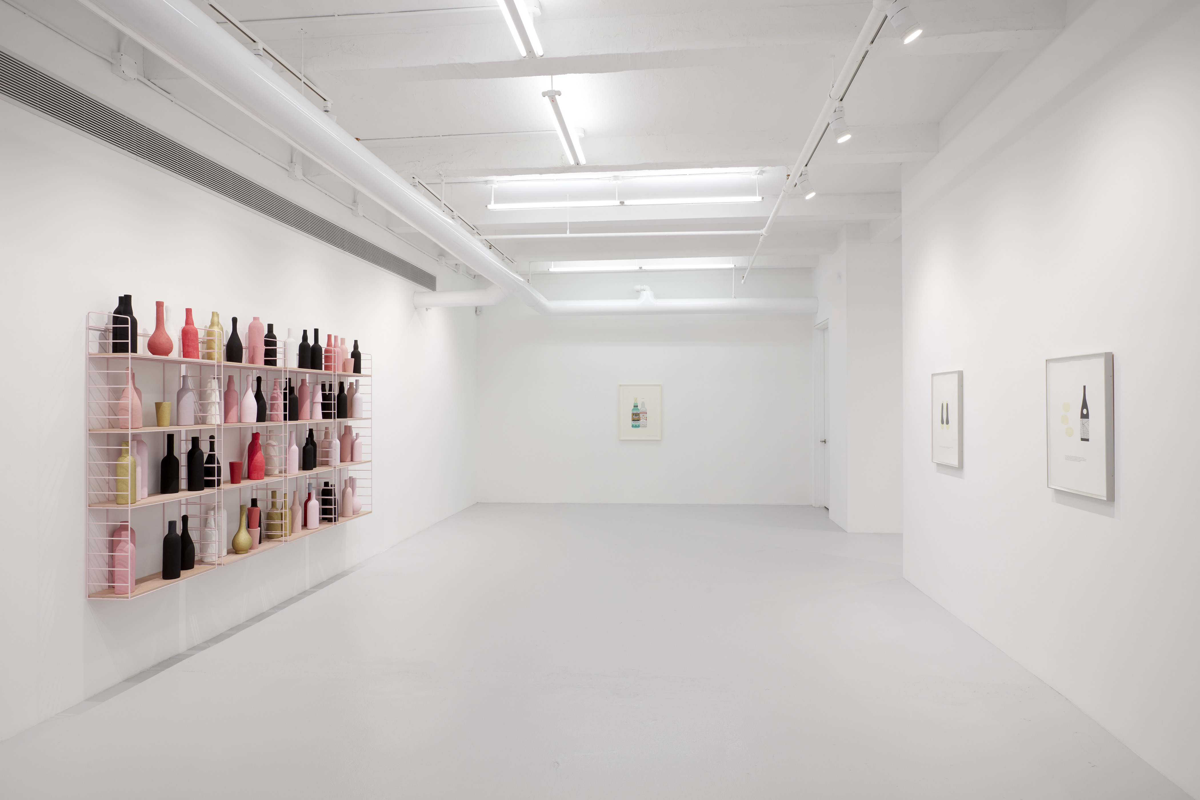
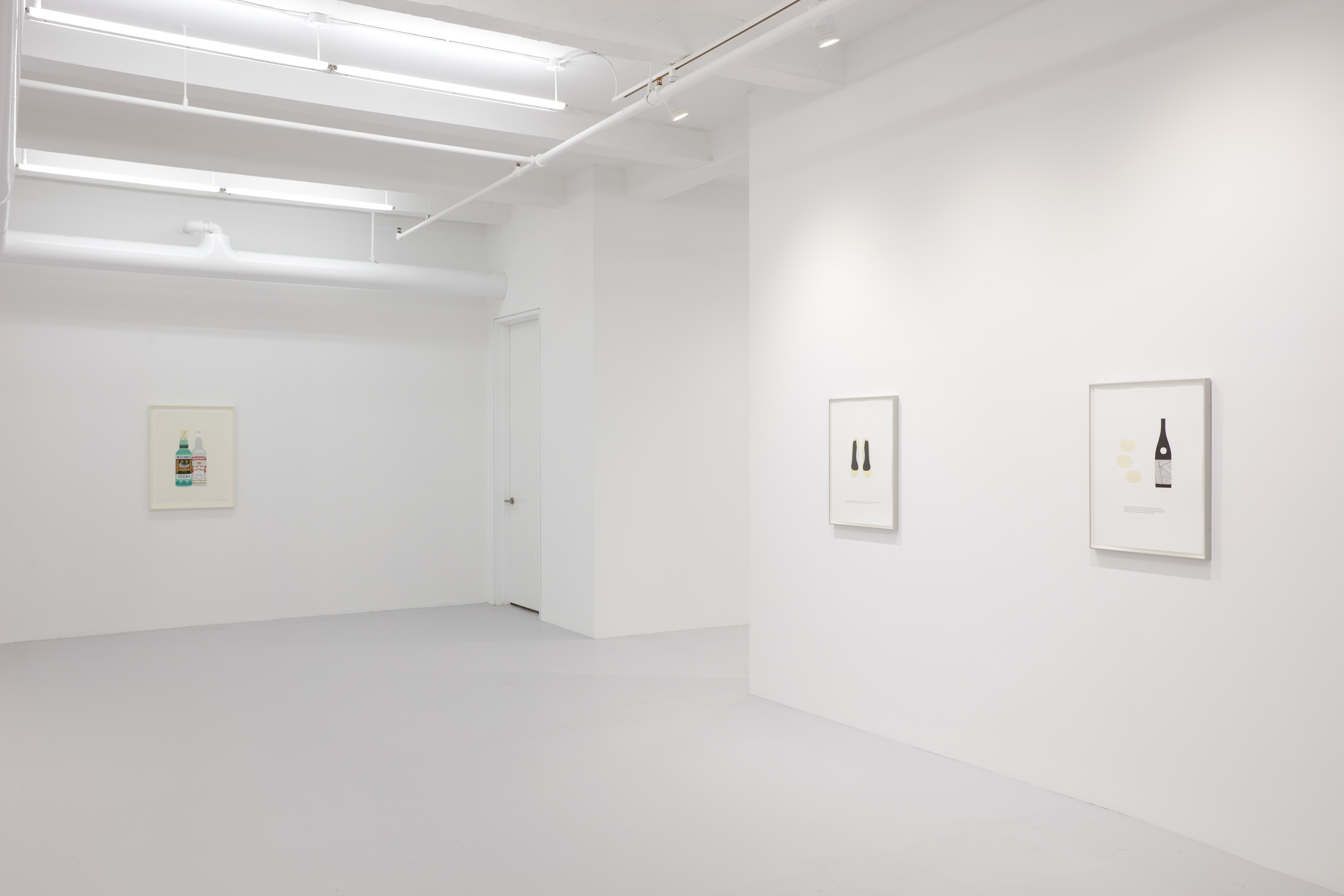
![]()
Installation view:
Matthew Brannon
Viewing Room
Casey Kaplan, New York
![]()
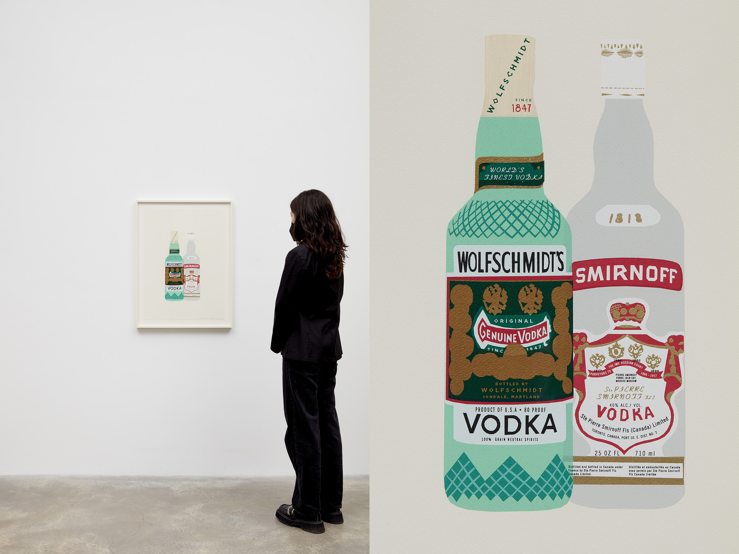
Matthew Brannon
Pretending to Remember, 2013
Silkscreen and hand painted acrylic on paper
27.5 x 20" / 69.9 x 50.8cm
Framed: 31.5 x 24" / 80 x 61cm
The detail of the branded logos of two vodka bottles, Wolfschmidst and Smirnoff, in Pretending to Remember (2013) marked a turning point towards a more elaborate layering of silkscreened and hand-painted elements. In the years that have followed, single compositions merge hundreds of screens in intricate networks of overlapping and boldly colored objects, intersecting language and image through evocations of dual meanings.
‘Pretending to Remember’ was an opportunity. After the disruption of the 2008 market crash that knocked the wind out of all that was interesting for a moment. (I've noticed the artworld -sometimes- tightens up during moments of societal stress. Conservative can mean just that - take less chances). I began to produce things entirely in my studio. (The letterpress works required the use of a different shop). My upcoming show had been canceled (a lucky break, really) and all these homeless images drifted in my head. If I didn't use the very staged (and expensive) process of letterpress how would I construct images using my own silkscreen shop? And while I was at it, what if I played with textless images? Can one ever really get rid of the text? And how about shifting the source material from high to low? By 2013 these silkscreen images were finally starting to make their own sort of sense. I still had no interest in making editions and was using the medium of print for its unique qualities. So I began to paint with print. Using endless screens and hand painting when I needed to.
Now looking back, I can see that it's here - when the text occasionally left the art that my research would eventually fill the power vacuum of ideas. Writing is my true love, but trying to sell my writing in a visual field was difficult. Did I abandon it? No, but I shifted the narrative.
![]()
Alternate view and detail: Matthew Brannon
Pretending to Remember, 2013
Silkscreen and hand painted acrylic on paper
27.5 x 20" / 69.9 x 50.8cm
Framed: 31.5 x 24" / 80 x 61cm
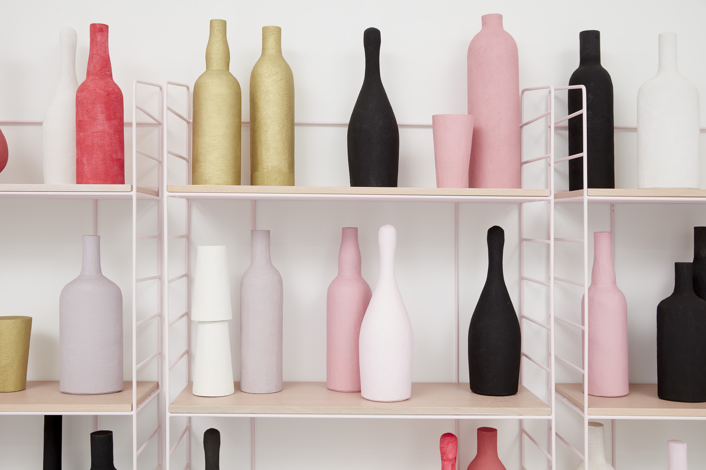
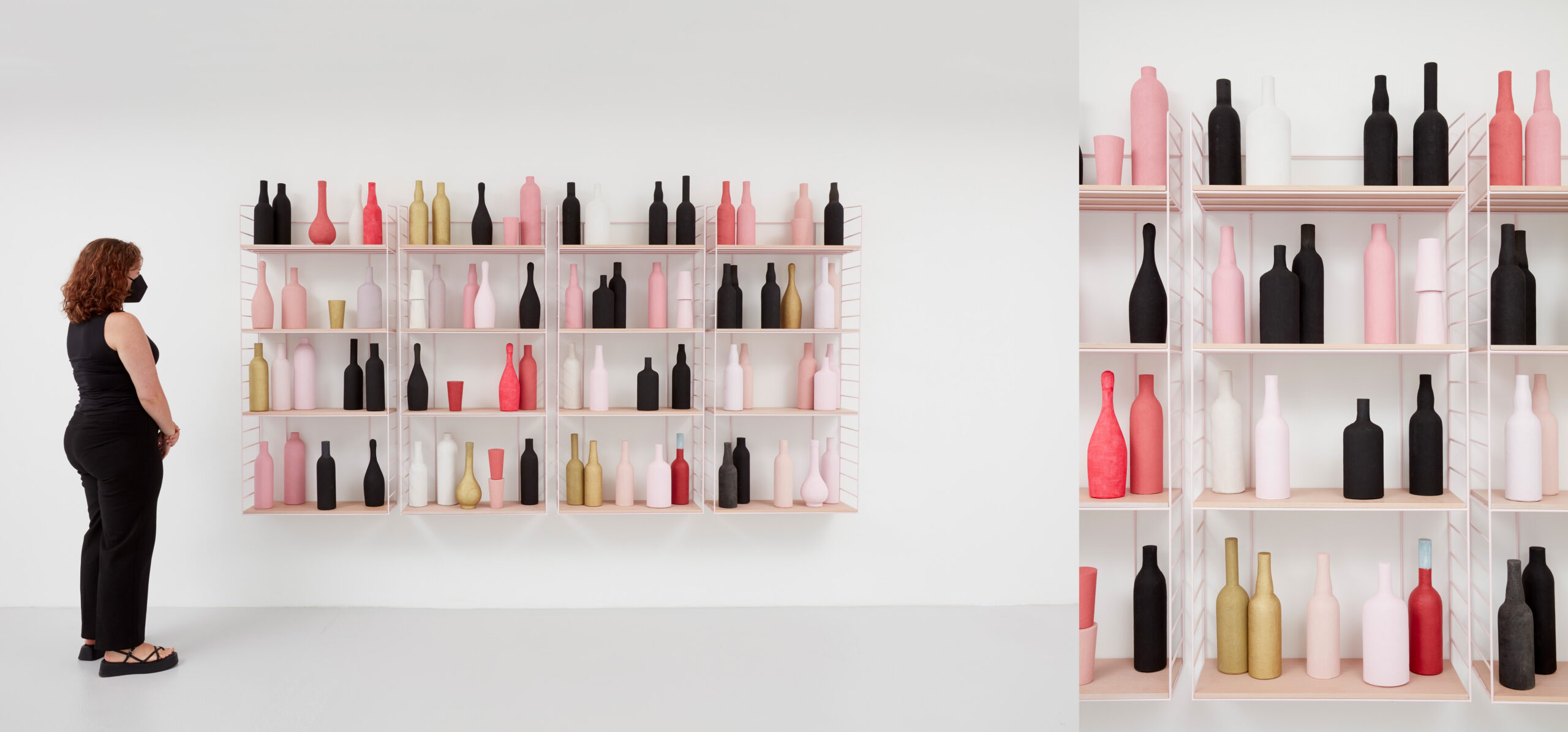
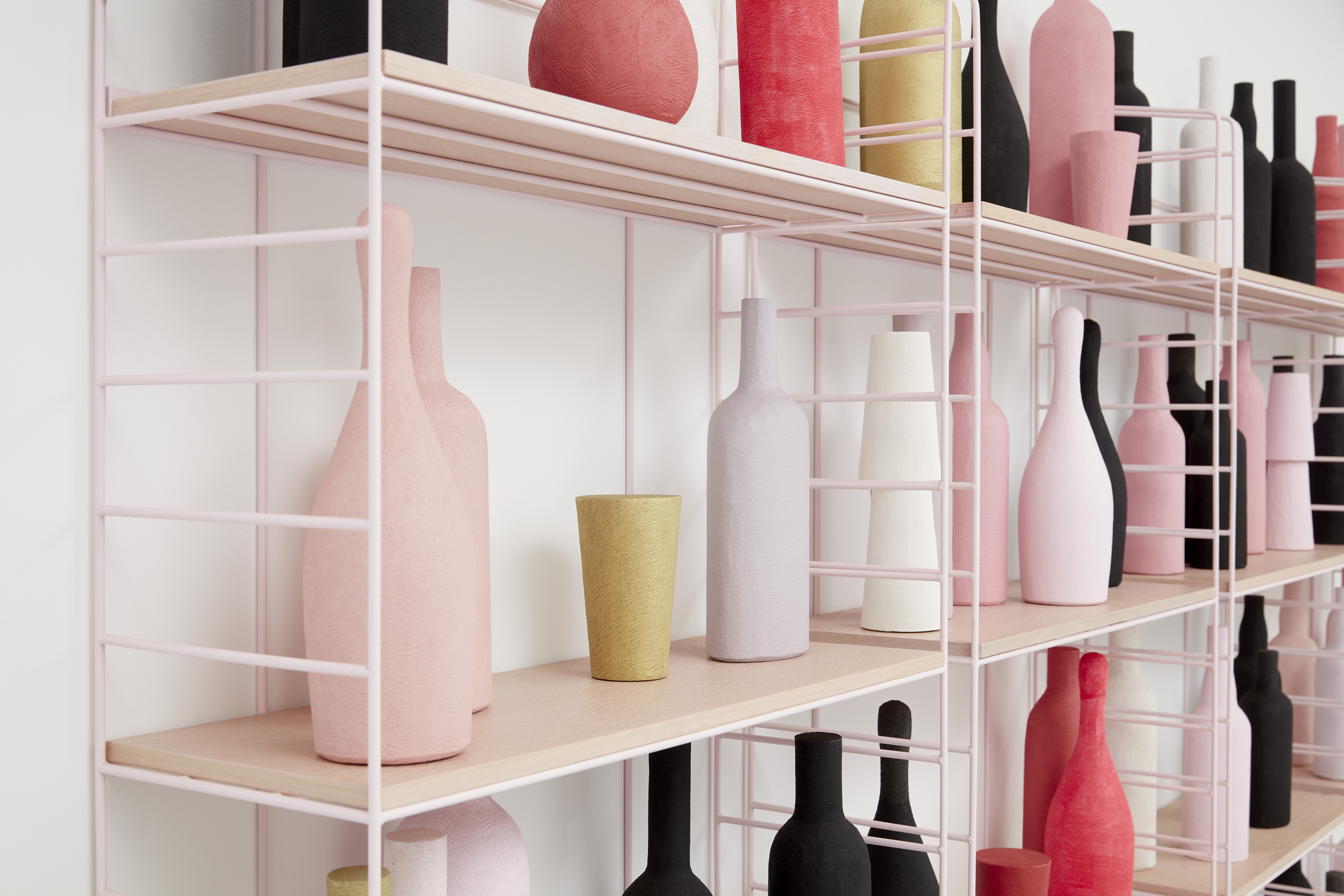
Brannon’s distinctive visual language within the prints extends into objects that both support and confuse underlying narratives, as seen in Early Retirement (2011), a sculpture comprised of metal, wood, hand-carved high-density foam, acrylic and enamel paint. A bizarre counterpoint to the imagery of its neighboring prints, the prop-like bar stacked with uncanny liquor bottles and glasses maintains a similar flatness present within the prints. The viewer is brought into a physical yet superficial experience driven by Brannon’s satirical fiction.
![]()
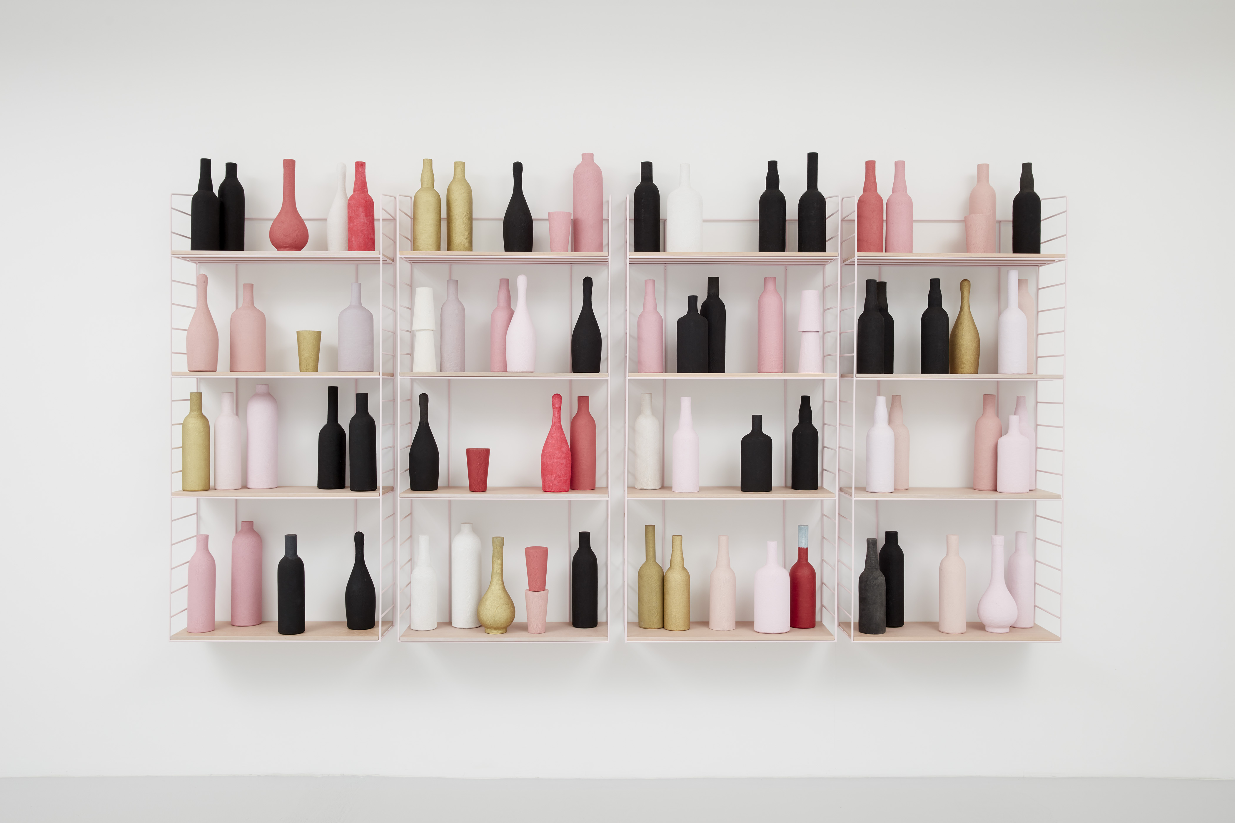
Matthew Brannon
Early Retirement, 2011
Metal, wood, hand-carved high density foam, acrylic, enamel
Installed dimensions: 56.5 x 111.25 x 9” / 143.5 x 282.6 x 22.9cm
I remember brainstorming my 2011 'Gentlemen’s Relish'*** exhibition at Casey Kaplan, where ‘Early Retirement’ was originally shown, with a notebook in hand in my old studio office that looked out over an intersection in midtown. I started with the scaffold of a plot that would generate the things I would make. There was always a murder, the great unraveling at the center. I remember a drunk dentist, a mortuary, a bar in a European train station. The plot was complex, and the traces of it in my show were diverse. On one end, framed text-based works that teased out scenes. More poetry than prose. On the other, sculptures of settings. I imagined making a large bar, like one I’d seen in Brussels.
I’ve always thought there was something dynamic in the way bars are arranged. All that potential. All that disaster. It’s like if you put a pile of money on display. My favorite bar of course is the bar cart. But for the plot's sake and the exhibition, I wanted to make this rather large wall-mounted non-domestic bar piece. The kind of bar that you’d find in a hotel lobby. I had been working with carving this pressed wood pulp material. I strived for a certain clunky sophistication. I really focused on the shapes. I wanted the image to be taken in instantaneously, but to also work like a painting — color moving across it.
The idea was that I would make sculptures that walked out of the prints I was making. That it would be to scale. Yet it would have the same abbreviated quality as my prints. The idea of the bar was much the subject as the thing in itself. It was the sensations of a bar; wealth, sophistication, disconnect, and self-destruction that would set the tone.
![]()
Detail: Matthew Brannon
Early Retirement, 2011
Metal, wood, hand-carved high density foam, acrylic, enamel
Installed dimensions: 56.5 x 111.25 x 9” / 143.5 x 282.6 x 22.9cm
*This exploratory subversion was born from both high and low sources. From the endless hours of pop music I’d been raised on — what I called the ‘pronoun game’ was always in full effect. And from my interest in Conceptual art (1967-1978) and interrogators of intention such as Jacques Derrida.
** If you’re interested, there are two key texts that go some ways to disentangle how these things are working. Jan Tumlir’s 2011 book “Hyenas Are...” by Mousse Press and the catalog essay in "To Say the Very Least," by Philip Monk for my 2007 show at the Art Gallery of York University, Toronto.
***I first heard the phrase when reading Nancy Mitford's "Love In A Cold Climate" (1949). Gentlemen’s Relish is a brand of British anchovy paste. For whatever reason, I laughed out loud when I read it and couldn’t get it out of my head. The title reads very differently if you’re unfamiliar with the context.
![]()
Detail:
Matthew Brannon
Early Retirement, 2011
Metal, wood, hand-carved high density foam, acrylic, enamel
Installed dimensions: 56.5 x 111.25 x 9” / 143.5 x 282.6 x 22.9cm