Casey Kaplan

Amanda Willaims in conversation with Amanda Gluibizzi
Brooklyn Rail | April 1, 2025
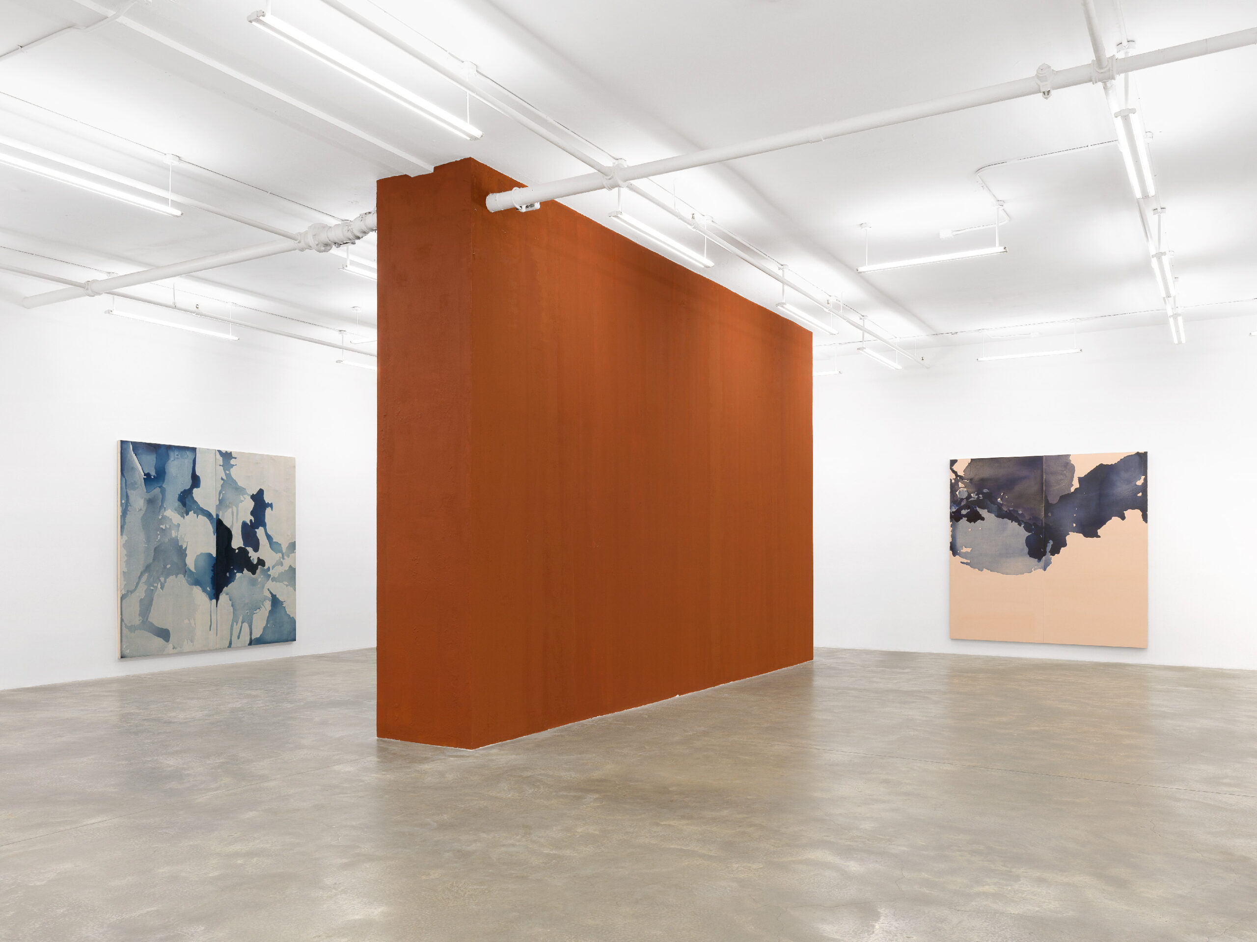
Run Together and Look Ugly after the First Rain at Casey Kaplan continues Amanda Williams’s exploration of color, questions about black and Blackness, and interest in the built environment while pushing her practice conceptually and materially. The exhibition takes its title from a series of instructional bulletins published by the scientist George Washington Carver about creating paints from natural ingredients found in his readers’ environments and how they could use them to develop a sense of ownership and pride of place in the places they lived.
Working with a team of scientific researchers, Williams reconstructed Carver’s patented formula for creating Prussian Blue paint from Alabaman red clay, a color she calls Innovation Blue. The show’s poured paintings (hung singly and in diptychs and triptychs), collages, and freestanding central wall all use the pigment held in different binders, which produce diverse effects and even distinctive hues. Williams has also paired Innovation Blue with the raw clay to yield a moving discourse on art, architecture, potential, loss, and, indeed, the promise of innovation. This interview has been edited from our conversation conducted in early March 2025.
Amanda Gluibizzi (Rail): What art makes you want to stop and go make your own?
Amanda Williams: Generally, it’s something where even if the aesthetic doesn’t necessarily seem like something that would connect with me, I’m very intrigued by artists’ process. When I feel like I can follow what might have been going on, that seems very exciting. When there are stretches in materiality or genuine concern for materiality, those are things that excite me and make me want to translate a way the artist might have approached something into what I’m doing. Obviously, there’s a risk factor that I think I also gravitate towards.
You know, Kendrick Lamar’s Super Bowl halftime performance was all the discussion for so many different reasons, and the subject of so many think pieces the next day. But for me, that was also one of those moments where you feel like this is a genuine artist who’s willing to take some risk with their art form. There are many layers and ways that we can critique and love or not love, but to constantly have that level of risk and vulnerability is exciting. And I literally wanted to turn the TV off—which is funny because of the song title, “tv off”—and run to my studio, at nine o’clock at night or whatever, and just start, buzzing with ideas. Those are the factors I’ve seen as a throughline over time, about risk-taking, materiality, vulnerability. When I see that, when that seems to emanate from the work, no matter what form the work is taking, that’s what gets me excited.
Rail: I like the idea of you throwing on your best pair of boot-cuts and running to your studio just so that you can go and make things. That’s a wonderful image.
When I was writing about abstraction a lot, I listened to a lecture by an art historian who said everybody thinks that abstraction is the great unknown in art, but actually it’s color. Color is the thing that people cannot know. You’ve talked about this a lot, about relations of color, the relativity of color. You speak so vibrantly and eloquently about color. Is color difficult for you? Or do you find that it’s something that you’re able to grab and then make meaning with?
Williams: Color is incredibly intuitive to me. And it wasn’t until I was maybe ten or eleven years old when I realized, “Oh, color doesn’t work like this for everybody? I don’t understand why it doesn’t work like that for you.” It’s always been something that I’ve felt at ease about and, in fact, feel most at home with. When it comes to color as a material, like mixing paint, the excitement of being able to mix any color is like nothing else I can describe. It’s a bit of a party trick, but it’s also this interesting way that I’m constantly seeing, literally, a full spectrum. There’s a blue-green and a green-blue. That first major box of Crayolas had sixty-four colors, and I felt like they really got me when there was both blue-green and green-blue, because they’re not the same thing!
Photo: Dan Bradica Studio